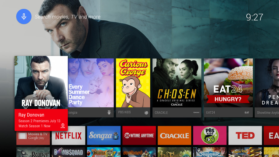
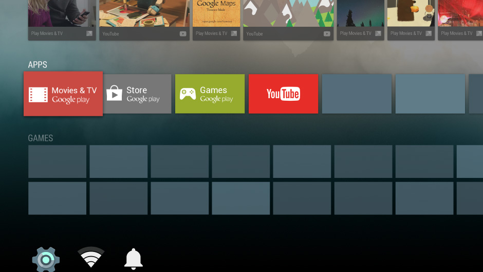
The Android TV platform user interface provides the launch pad for your app's big screen experience. It's important to understand how your app is presented in the main user interface and how your app can help users get to the content they want quickly.
Home Screen
The Home Screen is the start of the user experience, providing search, content recommendations, and access to apps and settings. This screen provides a rich and cinematic overview of apps and content.

Search
By bringing the power of Google search to the big screen, Android TV makes new, dynamic connections between content. A favorite movie may lead to the discovery of a new music artist, planning a trip to Paris might surface new YouTube content and photos.

To learn more about searching within your app, see Searching in TV Apps .
Recommendations
The recommendations row on Android TV is a central feature of the Home Screen that allows users quick access to dynamic and relevant content for their media-consumption activities. The row is optimized for quick browsing of personalized content and activity resumption (on the device and across devices), while also providing a way for users to act on meaningful new content.

Recommendations are based on the user’s recent and frequent usage behaviors, as well as expressed content preferences. They appear as cards that represent a system or app action, notification, activity, or piece of actionable media. Your app can provide suggestions for the recommendations row to help get your content noticed. To learn more, see Recommendations .
Apps and Games
Apps and Games rows both have special areas on the Home Screen. Within their respective areas, Apps and Games titles are ordered to reflect the user’s recent usage.

Settings
Access to Settings is found at the bottom of the Home Screen. From here, the user can access Android and device-specific settings.
