Please note that the contents of this offline web site may be out of date. To access the most recent documentation visit the online version .
Note that links that point to online resources are green in color and will open in a new window.
We would love it if you could give us feedback about this material by filling this form (You have to be online to fill it)


Your First Multi-device Site

Create Your Content and Structure

Content is the most important aspect of any site. So let’s design for the content and not let the design dictate the content. In this guide, we identify the content we need first, create a page structure based on this content, and then present the page in a simple linear layout that works well on narrow and wide viewports.

Create the page structure

We have identified we need:

  1. An area that describes at a high-level our product “CS256: Mobile web development” course
  2. A form to collect information from users who are interested in our product
  3. An in depth description and video
  4. Images of the product in action
  5. A data table with information to back the claims up

TL;DR

  • Identify the content you need first.
  • Sketch out Information Architecture (IA) for narrow and wide viewports.
  • Create a skeleton view of the page with content but without styling.

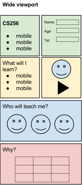
We have also come up with a rough information architecture and layout for both the narrow and wide viewports.

Narrow Viewport IA Wide Viewport IA

This can be converted easily into the rough sections of a skeleton page that we will use for the rest of this project.

    <!doctype html>
    <html>
      <head>
         <meta name="viewport" content="width=device-width, initial-scale=1.0">
         <title>CS256: Mobile Web development - structure</title>
      </head>
      <body>
        <div id="headline">
          <header>
            <h1></h1>
            <p></p>
          </header>
          <div id="blurb">
            <p></p>
            <ul>
              <li>
            </ul>
          </div>
          <form method="post" id="register">
          </form>
        </div>
        <div id="section1">
          <h2></h2>
          <p></p>
          <ul>
            <li>
          </ul>
          <video></video>
        </div>
        <div id="section2">
          <h2></h2>
          <p></p>
          <div id="images">
            <img>
          </div>
        </div>
        <div id="section3">
          <h2></h2>
          <p></p>
        </div>
        <footer>
          <p></p>
        </footer>
          </body>
    </html>
View full sample

Add content to the page

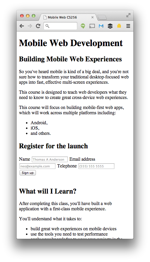
The basic structure of the site is complete. We know the sections we need, the content to display in those sections, and where to position it in the overall information architecture. We can now start to build out the site.

Note

  • Styling will come later

Create the headline and form

The headline and request notification form are the critical components of our page. These must be presented to the user immediately.

In the headline, add simple text to describe the course:

    <div id="headline">
      <div class="container">
        <header>
          <h1>Mobile Web Development</h1>
          <p>Building Mobile Web Experiences</p>
        </header>
        <div id="blurb">
          <p>So you've heard mobile is kind of a big deal, and you're not
          sure how to transform your traditional desktop-focused web apps
          into fast, effective multi-device experiences.</p>
          <p>This course is designed to teach web developers what
          they need to know to create great cross-device web
          experiences.</p>
          <p>This course will focus on building mobile-first web apps,
          which will work across multiple platforms including:</p>
          <ul>
            <li>Android,</li>
            <li>iOS,</li>
            <li>and others.</li>
          </ul>
        </div>
        <form method="post" id="register">
        </form>
      </div>
    </div>
    
View full sample

We need to also fill out the form. It will be a simple form that collects the users’ names, their phone number, and a good time to call them back.

All forms should have labels and placeholders to make it easy for users to focus elements, understand what is supposed to go in them, and to also help accessibility tools understand the structure of the form. The name attribute not only sends the form value to the server, it is also used to give important hints to the browser about how to automatically fill in the form for the user.

We will add semantic types to make it quick and simple for users to be able to enter content on a mobile device. For example, when entering a telephone number, the user should just see a dial pad.

    <form method="post" id="register">
       <h2>Register for the launch</h2>
       <label for="name">Name</label>
       <input type="text" name="name" id="name"
          placeholder="Thomas A Anderson" required>
       <label for="email">Email address</label>
       <input type="email" name="email" id="email"
          placeholder="[email protected]" required>
       <label for="tel">Telephone</label>
       <input type="tel" name="tel" id="tel"
          placeholder="(555) 555 5555" required>
       <input type="submit" value="Sign up">
    </form>
    
View full sample

Create the Video and Information section

The Video and Information section of content will contain a little more depth. It will have a bulleted list of features of our products and will also contain a video placeholder that shows our product working for the user.

    <div id="section1">
      <div class="container">
        <h2>What will I learn?</h2>
        <p>After completing this class, you'll have built a web application with a first-class mobile experience.</p>
        <p>You'll understand what it takes to:</p>
        <ul>
          <li>build great web experiences on mobile devices</li>
          <li>use the tools you need to test performance</li>
          <li>apply your knowledge to your own projects in the future</li>
        </ul>
        <video controls poster="udacity.png">
          <source src="udacity.mp4" type="video/mp4"></source>
          <source src="udacity.webm" type="video/webm"></source>
          <p>Sorry your browser doesn't support video.
             <a href="udacity.mov">Download the video</a>.
          </p>
        </video>
        <br>
      </div>
    </div>
    
View full sample

Videos are often used to describe content in a more interactive manner and are frequently used to show a demonstration of a product or a concept.

By following the best practices, you can easily integrate video into your site:

  • Add a controls attribute to make it easy for people to play the video.
  • Add a poster image to give people a preview of the content.
  • Add multiple <source> elements based on supported video formats.
  • Add fall-back text to let people download the video if they can’t play it in the window.
    <video controls poster="udacity.png">
      <source src="udacity.webm" type="video/webm"></source>
      <source src="udacity.mov" type="video/mov"></source>
      <p>Sorry your browser doesn't support video.
         <a href="udacity.mov">Download the video</a>.
      </p>
    </video>
    
View full sample

Create the Images Section

Sites without images can be a little boring. There are two types of images:

  • Content images — images that are in-line in the document and are used to convey extra information about the content.
  • Stylistic images — images that are used to make the site look better; often these are background images, patterns and gradients. We will cover this in the next article .

The Images section in our page is a collection of content images.

Content images are critical to conveying the meaning of the page. Think of them like the images used in newspaper articles. The images we are using are pictures of the tutors on the project: Chris Wilson, Peter Lubbers and Sean Bennet.

    <div id="section2">
      <h2>Instructors</h2>
      <p>The worlds leading mobile autorities</p>
    
      <div id="images">
        <img src="chriswilson.png" alt="Chris Wilson: Course Instructor">
        <img src="peterlubbers.png" alt="Peter Lubbers: Course Instructor">
        <img src="seanbennett.png" alt="Sean Bennet: Course Developer">
      </div>
    
      <br>
    </div>
    
View full sample

The images are set to scale to 100% of the width of the screen. This works well on devices with a narrow vieport, but less well on those with a wide viewport (like desktop). We will manage this in the responsive design section.

Many people don’t have the ability to view images and often use an assistive technology such as a screen reader that will parse the data on the page and relay that to the user verbally. You should ensure that all your content images have a descriptive alt tag that the screen reader can speak out to the user.

When adding alt tags make sure that you keep the alt text as concise as possible to fully describe the image. For example in our demo we simply format the attribute to be “Name: Role”, this presents enough information to the user to understand that this section is about the authors and what their job is.

Add the Tabulated Data Section

The final section is a simple table that is used to show specific product stats about the product.

Tables should only be used for tabular data, i.e, matrices of information.

    <div id="section3">
      <h2>Mobile. Why should I care?</h2>
      <p>It is huge.  Everywhere.</p>
      <table>
        <caption>
          <p>Data from <a href="http://gs.statcounter.com/#desktop+mobile+tablet-comparison-ww-monthly-201303-201403">StatsCounter</a></p>
        </caption>
        <thead>
           <tr>
             <th>Country</th>
             <th>Desktop share</th>
             <th>Tablet share</th>
             <th>Mobile share</th>
           </tr>
        </thead>
        <colgroup>
           <col span="1">
           <col span="1">
           <col span="1">
           <col span="1">
        </colgroup>
        <tbody>
         <tr>
            <td data-th="Country"><a href="http://gs.statcounter.com/#desktop+mobile+tablet-comparison-IN-monthly-201303-201403">India</a></td>
            <td data-th="Desktop share">32%</td>
            <td data-th="Tablet share">1%</td>
            <td data-th="Mobile share">67%</td>
          </tr>
          <tr>
            <td data-th="Country"><a href="http://gs.statcounter.com/#desktop+mobile+tablet-comparison-GB-monthly-201303-201403">GB</a></td>
            <td data-th="Desktop share">69%</td>
            <td data-th="Tablet share">13%</td>
            <td data-th="Mobile share">18%</td>
          </tr>
          <tr>
            <td data-th="Country"><a href="http://gs.statcounter.com/#desktop+mobile+tablet-comparison-US-monthly-201303-201403">US</a></td>
            <td data-th="Desktop share">69%</td>
            <td data-th="Tablet share">9%</td>
            <td data-th="Mobile share">22%</td>
          </tr>
          <tr>
            <td data-th="Country"><a href="http://gs.statcounter.com/#desktop+mobile+tablet-comparison-CN-monthly-201303-201403">China</a></td>
            <td data-th="Desktop share">86%</td>
            <td data-th="Tablet share">4%</td>
            <td data-th="Mobile share">10%</td>
          </tr>
        </tbody>
      </table>
      <br>
    </div>
    
View full sample

Most sites need a footer to display content such as Terms and Conditions, disclaimers, and other content that isn’t meant to be in the main navigation or in the main content area of the page.

In our site, we will just link to Terms and Conditions, a Contact page, and our social media profiles.

    <footer>
      <div class="container">
        <p>We always need a footer.</p>
      </div>
    </footer>
    
View full sample

Summary

We have created the outline of the site and we have identified all the main structural elements. We have also made sure that we have all the relevant content ready and in-place to satisfy our business needs.

Content

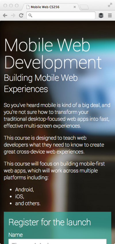
You will notice that the page looks terrible right now; this is intentional. Content is the most important aspect of any site and we needed to make sure we had a good solid information architecture and density. This guide has given us an excellent base to build upon. We will style our content in the next guide.

Updated on 2014-04-23

Except as otherwise noted, the content of this page is licensed under the Creative Commons Attribution 3.0 License , and code samples are licensed under the Apache 2.0 License . For details, see our Site Policies .