Please note that the contents of this offline web site may be out of date. To access the most recent documentation visit the online version .
Note that links that point to online resources are green in color and will open in a new window.
We would love it if you could give us feedback about this material by filling this form (You have to be online to fill it)


Get Started

Your First Multi-device Site

Building multi-device experiences is not as hard as it sounds. By following this guide, we will build an example product landing page for our CS256 Mobile Web Development course that works well across all different device types.
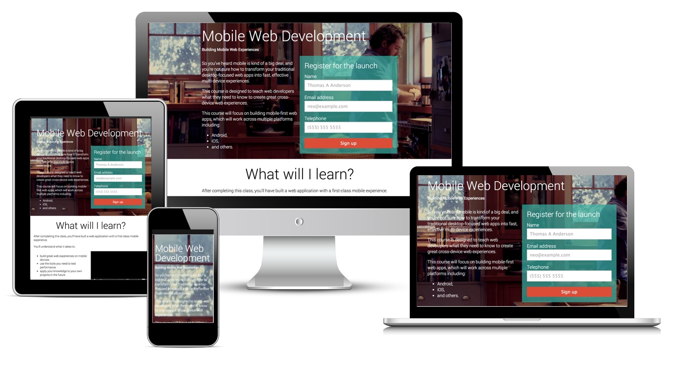
many devices showing the final project

Building for multiple devices with differing capabilities, vastly different screen sizes and interaction methods can seem daunting, if not impossible to get started.

It is not as hard to build fully responsive sites as you think, and to show you, this guide takes you through the steps that you can use to get started. We have broken it into two simple steps:

  1. Defining the information architecture (commonly known as IA) and structure of the page,
  2. Adding design elements to make it responsive and look good across all devices.

Except as otherwise noted, the content of this page is licensed under the Creative Commons Attribution 3.0 License , and code samples are licensed under the Apache 2.0 License . For details, see our Site Policies .