Please note that the contents of this offline web site may be out of date. To access the most recent documentation visit the online version .
Note that links that point to online resources are green in color and will open in a new window.
We would love it if you could give us feedback about this material by filling this form (You have to be online to fill it)


Add Touch to Your Site

Stateful Elements Respond to Touch

Touchscreens are available on more and more devices, ranging from phones up to desktop screens. When your users choose to interact with your UI, your app should respond to their touch in intuitive and beautiful ways.

Add Touch States

Have you ever touched or clicked an element on a web page and questioned whether the site actually detected it?

Simply altering the color of elements as users touch parts of your UI gives a basic reassurance that your site is working. Not only does this alleviate frustation, but can also give a snappy and responsive feel to your site.

Use Pseudo Classes to Change UI for each Touch State

The fastest way to support touch is to change the UI in response to a DOM element’s change in state.

TL;DR

  • Make your site feel snappy and responsive: change the UI for each state :hover, :active and :focus.
  • Don’t override a browser’s default responses to touch and focus unless you are implementing your own UI changes.
  • Disable text selection on elements users will touch, unless there’s a good reason why users might need to copy / select the text.

DOM elements can be in one of the following states, default, focus, hover, and active. To change our UI for each of these states, we need to apply styles to the following pseudo classes :hover , :focus and :active as shown below:

    .btn {
      background-color: #4285f4;
    }

    .btn:hover {
      background-color: #296CDB;
    }

    .btn:focus {
      background-color: #0F52C1;
    
      /* The outline parameter surpresses the border
      color / outline when focused */
      outline: 0;
    }

    .btn:active {
      background-color: #0039A8;
    }
    
View full sample

See Pseudo classes for touch states :
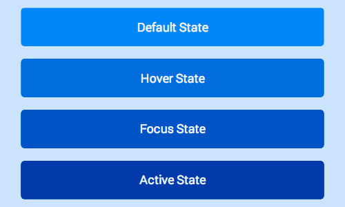
Image illustrating the different colors for button states

Hover and Focus Stickiness

On most mobile browsers hover and/or focus states will apply to an element after it’s been tapped.

Consider carefully what styles you set and how they will look to the user after they finish their touch.

Bear in mind that anchor tags and buttons may have different behaviour in different browsers, so assume in some cases hover will remain and in others focus will remain.

Enabling Active State Support on iOS

Unfortunately, Safari on iOS does not apply the active state by default, to get it working you need to add a touchstart event listener to the document body or to each element.

You should do this behind a user agent test so it’s only run on iOS devices.

Adding a touch start to the body has the advantage of applying to all elements in the DOM, however this may have performance issues when scrolling the page.

window.onload = function() {
  if(/iP(hone|ad)/.test(window.navigator.userAgent)) {
    document.body.addEventListener('touchstart', function() {}, false);
  }
};

The alternative is to add the touch start listeners to all the interactable elements in the page, alleviating some of the performance concerns.

window.onload = function() {
  if(/iP(hone|ad)/.test(window.navigator.userAgent)) {
    var elements = document.querySelectorAll('button');
    var emptyFunction = function() {};
    for(var i = 0; i < elements.length; i++) {
      elements[i].addEventListener('touchstart', emptyFunction, false);
    }
  }
};

Override Default Browser Styles for Touch States

Once you add styles for the different states, you’ll notice that most browsers implement their own styles to respond to a user’s touch, you should override these defaults when you’ve added your own styles.

Remember

  • Only override browser styles if you are implementing your own!

Override Tap Highlight Styles

When mobile devices first launched, a number of sites didn’t have styling for the active state. As a result, many browsers add a highlight color or style to elements when a user touches them.

Safari and Chrome add a tap highlight color which can be prevented with the -webkit-tap-highlight-color CSS property:

    /* Webkit / Chrome Specific CSS to remove tap
    highlight color */
    .btn {
      -webkit-tap-highlight-color: transparent;
    }
    
View full sample

Internet Explorer on Windows Phone has a similar behavior, but is suppressed via a meta tag:

<meta name="msapplication-tap-highlight" content="no">

Override FirefoxOS Button State Styles

The Firefox -moz-focus-inner pseudo class includes an outline on touchable elements. You can remove this outline by setting the border: 0 .

If you are using a <button> element, you get a gradient applied to your button which you can remove by setting background-image: none .

    /* Firefox Specific CSS to remove button
    differences and focus ring */
    .btn {
      background-image: none;
    }

    .btn::-moz-focus-inner {
      border: 0;
    }
    
View full sample

Override Element Outline in Focus State

Suppress the outline color when an element is focused using outline: 0 .

.btn:focus {
  outline: 0;

  // Add replacement focus styling here (i.e. border)
}

Disable user-select on UI which Responds to Touch

Some mobile browsers will select text if the user long presses on the screen. This can result in a bad user experience if the user accidentally presses down on a button for too long. You can prevent this from happening using the user-select CSS property.

-moz-user-select: none;
-webkit-user-select: none;
-ms-user-select: none;
user-select: none;

Remember

  • You should be cautious not to disable user selection if the information on the element may be useful to the user (phone number, e-mail address, and so on).

Reference

Pseudo Classes for Touch States

Class Example Description
:hover Button in Pressed State This state is entered when a is cursor placed over an element. Changes in UI on hover are helpful to encourage users to interact with elements.
:focus Button with Focus State When you tab through elements on a page, you are moving the focus from one element to the next. The focus state allows the user to know what element they are currently interacting with; also allows users to navigate your UI easily using a keyboard.
:active Button in Pressed State This is the state an element has when it's being selected, for example a user clicking or touching an element.

Updated on 2014-01-06

Authors

Matt Gaunt

Except as otherwise noted, the content of this page is licensed under the Creative Commons Attribution 3.0 License , and code samples are licensed under the Apache 2.0 License . For details, see our Site Policies .