Please note that the contents of this offline web site may be out of date. To access the most recent documentation visit the online version .
Note that links that point to online resources are green in color and will open in a new window.
We would love it if you could give us feedback about this material by filling this form (You have to be online to fill it)


Images

Images in Markup

The img element is powerful – it downloads, decodes and renders content – and modern browsers support a range of image formats. Including images that work across devices is no different than for desktop, and only requires a few minor tweaks to create a good experience.

TL;DR

  • Use relative sizes for images to prevent them from accidentally overflowing the container.
  • Use the picture element when you want to specify different images depending on device characteristics (a.k.a. art direction).
  • Use srcset and the x descriptor in the img element to give hints to the browser about the best image to use when choosing from different densities.

Use relative sizes for images

Remember to use relative units when specifying widths for images to prevent them from accidentally overflowing the viewport. For example, width: 50%; , will cause the image width to be 50% of the containing element (not the viewport or actual pixel size).

Because CSS allows content to overflow it’s container, it may be necessary use max-width: 100% to prevent images and other content from overflowing. For example:

img, embed, object, video {
  max-width: 100%;
}

Be sure to provide meaningful descriptions via the alt attribute on img elements; these help make your site more accessible by providing context to screen readers and other assistive technologies.

Enhance img ’s with srcset for high DPI devices

The srcset attribute enhances the behavior of the img element, making it easy to provide multiple image files for different device characteristics. Similar to the image-set CSS function native to CSS, srcset allows the browser to choose the best image depending on the characteristics of the device, for example using a 2x image on a 2x display, and potentially in the future, a 1x image on a 2x device when on a limited bandwidth network.

<img src="photo.png" srcset="[email protected] 2x" ...>

On browsers that don’t support srcset , the browser simply uses the default image file specified by the src attribute. This is why it is important to always include a 1x image that can be displayed on any device, regardless of capabilities. When srcset is supported, the comma-separated list of image/conditions is parsed prior to making any requests, and only the most appropriate image is downloaded and displayed.

While the conditions can include everything from pixel density to width and height, only pixel density is well supported today. To balance current behavior with future features, stick with simply providing the 2x image in the attribute.

Art direction in responsive images with picture

Changing images based on device characteristics, also known as art direction can be accomplished using the picture element. The picture element defines a declarative solution for providing multiple versions of an image based on different characteristics, like device size, device resolution, orientation, and more.
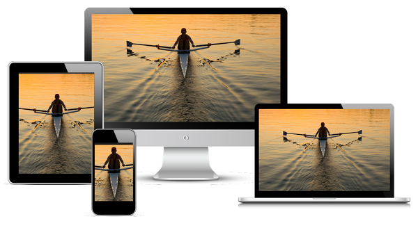
Art direction example

Important

  • The picture element is still under development and as of June 2014 is only available in nightlies. Because of it’s strong backward compatibility and the Picturefill polyfill , we have included it now and recommend you use it with caution. See the ResponsiveImages.org site for further details.

The picture element should be used when an image source exists in multiple densities, or when a responsive design dictates a somewhat different image on some types of screens. Similar to the video element, multiple source elements can be included, making it possible to specify different image files depending on media queries or image format.

    <picture>
      <source media="(min-width: 800px)" srcset="head.jpg, head-2x.jpg 2x">
      <source media="(min-width: 450px)" srcset="head-small.jpg, head-small-2x.jpg 2x">
      <img src="head-fb.jpg" srcset="head-fb-2x.jpg 2x" >
    </picture>
    
View full sample

In the above example, if the browser width is at least 800px, then either head.jpg or head-2x.jpg will be used, depending on the device resolution. If the browser is between 450px and 800px, then either head-small.jpg or head-small-2x.jpg will be used, again, depending on the device resolution. For screen widths less than 450px and backwards compatibility where the picture element isn’t supported, the browser will render the img element instead, and should always be included.

Relative sized images

When the final size of the image isn’t known, it can be difficult to specify a density descriptor for the image sources. This is especially true for images that span a proportional width of the browser and are fluid, depending on the size of the browser.

Instead of supplying fixed image sizes and densities, the size of each supplied image can be specified by adding a width descriptor along with the size of the image element, allowing the browser to automatically calculate the effective pixel density and choose the best image to download.

    <img src="lighthouse-200.jpg" sizes="50vw"
         srcset="lighthouse-100.jpg 100w, lighthouse-200.jpg 200w,
                 lighthouse-400.jpg 400w, lighthouse-800.jpg 800w,
                 lighthouse-1000.jpg 1000w, lighthouse-1400.jpg 1400w,
                 lighthouse-1800.jpg 1800w">
    
View full sample

The above example renders an image that is half of the viewport width ( sizes="50vw" ), and depending on the width of the browser and it’s device pixel ratio, allowing the browser to choose the correct image regardless of how large the browser window is. For example, the table below shows which image the browser would choose:

Browser width Device pixel ratio Image used Effective resolution
400px 1 200.png 1x
400px 2 400.png 2x
320px 2 400.png 2.5x
600px 2 800.png 2.67x
640px 3 1000.png 3.125x
1100px 1 1400.png 1.27x

Account for breakpoints in responsive images

In many cases, the size or image may change depending on the site’s layout breakpoints. For example, on a small screen, you might want the image to span the full width of the viewport, while on larger screens, it should only take a small proportion.

    <img src="400.png"
         sizes="(min-width: 600px) 25vw, (min-width: 500px) 50vw, 100vw"
         srcset="100.png 100w, 200.png 200w, 400.png 400w,
                 800.png 800w, 1600.png 1600w, 2000.png 2000w">
    
View full sample

The sizes attribute in the above example uses several media queries to specify the the size of them image. When the browser width is greater than 600px, the image will be 25% of the viewport width, when it is between 500px and 600px, the image will be 50% of the viewport width, and below 500px, it will be full width.

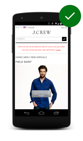
Make product images expandable

Customers want to see what they’re buying. On retail sites, users expect to be able to view high resolution closeups of products to get a better look at details, and study participants got frustrated if they weren’t able to.

J. Crews website with expandable product image
J. Crew's website with expandable product image.

A good example of tappable, expandable images is provided by the J. Crew site.
An disappearing overlay indicates that an image is tappable, providing a zoomed in image with fine detail visible.

Other image techniques

Compressive images

The compressive image technique serves a highly compressed 2x image to all devices, no matter the actual capabilities of the device. Depending on the type of image and level of compression, image quality may not appear to change, but the file size drops significantly.

See example

Important

  • Use caution with the compressive technique because of the increased memory and decoding costs it requires. Resizing large images to fit on smaller screens is expensive and can be particularly painful on low-end devices where both memory and processing is limited.

JavaScript image replacement

JavaScript image replacement checks the capabilities of the device and “does the right thing”. You can determine device pixel ratio via window.devicePixelRatio , get screen width and height, and even potentially do some network connection sniffing via navigator.connection or issuing a fake request. Once you’ve collected all of this information, you can decide which image to load.

One big drawback to this approach is that using JavaScript means that you will delay image loading until at least the look-ahead parser has finished. This means that images won’t even start downloading until after the pageload event fires. In addition, the browser will most likely download both the 1x and 2x images, resulting in increased page weight.

Updated on 2014-08-06

Except as otherwise noted, the content of this page is licensed under the Creative Commons Attribution 3.0 License , and code samples are licensed under the Apache 2.0 License . For details, see our Site Policies .