Principles of Site Design
Site Search
Site search is vital for helping mobile users find what they're looking for in a hurry.
Site search is vital for helping mobile users find what they're looking for in a hurry.
TL;DR
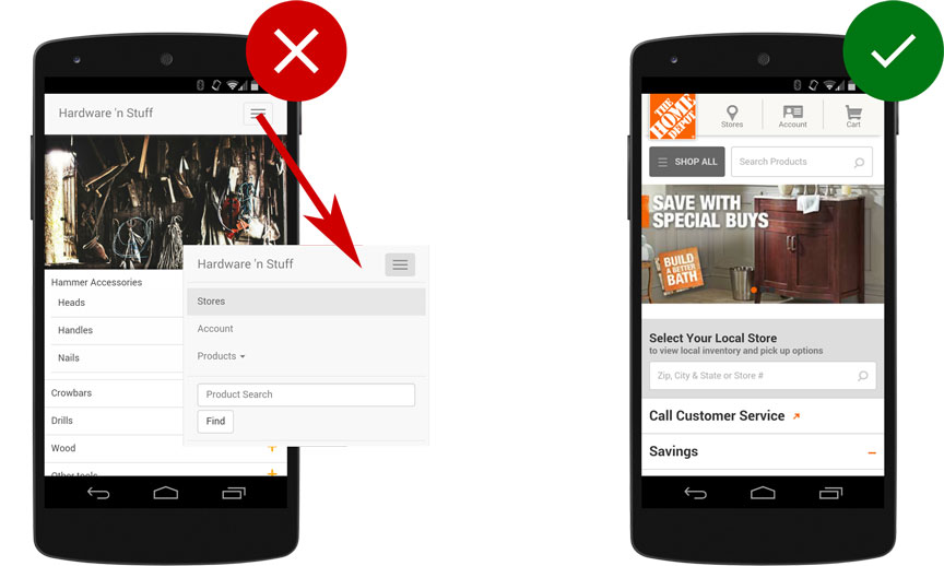
Users looking for specific information usually turn to search - so search should be one of the first things mobile users see on your site, avoid hiding it behind a menu. In the study, participants responded best to easily-visible, open text search boxes at the top of a page.
Search should be smart, providing users with the best and most relevant results so they don’t have to swipe through multiple pages of results. Make life easier for users with smart-search features like autocomplete, corrected misspellings and suggesting search terms or providing related matches.
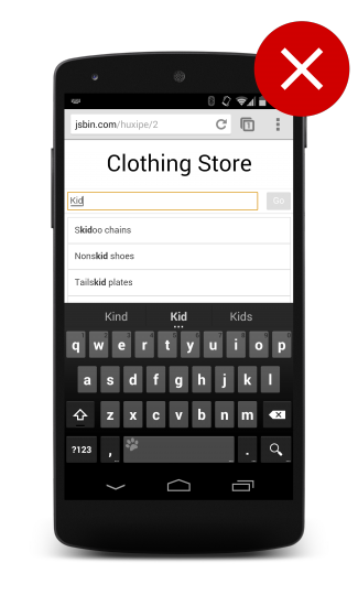
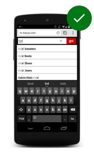
Participants didn’t bother to swipe through multiple pages of search results. Instead, they judged a site’s search based on the results it returned first, so make sure your first page of search results are the strongest.
Provide easy to use filters to help narrow the search results to more relevant results for users. Participants relied on filters to narrow down search results, and actually abandoned sites that couldn’t reduce volume. However, you also need to ensure users don’t filter themselves into a box - one car dealer site allowed participants to specify configurations that didn’t actually exist. Help users avoid problems by letting them know how many results will be returned with a particular filter applied.
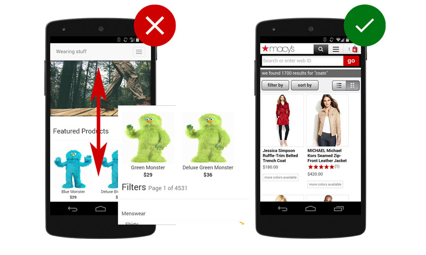
Don’t bury the filters at the bottom of the page where users have to scroll to the end of the result set before they can begin to filter what they’re looking for.
For sites that serve diverse customer segments, it can be helpful to ask users a few questions before they search to ensure they get results from the most relevant content segment.
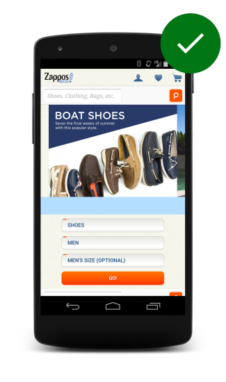
For example, a large shoe retailer began its mobile searches by having participants select the gender and size of shoe they were looking for.
Updated on 2014-08-06
Except as otherwise noted, the content of this page is licensed under the Creative Commons Attribution 3.0 License , and code samples are licensed under the Apache 2.0 License . For details, see our Site Policies .