Create Amazing Forms
Design efficient forms
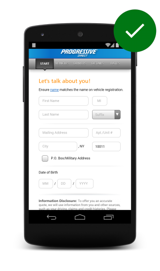
Design efficient forms by avoiding repeated actions, asking for only the necessary information and guide users by showing them how far along they are in multi-part forms.
Design efficient forms by avoiding repeated actions, asking for only the necessary information and guide users by showing them how far along they are in multi-part forms.
TL;DR
Make sure your forms have no repeated actions, only as many fields as necessary, and take advantage of autofill , so that users can easily complete forms with pre-populated data.

Look for opportunities to pre-fill information you already know, or may anticipated to save the user from having to provide it. For example, pre-populate the shipping address with the last shipping address supplied by the user.
Progress bars and menus should accurately convey overall progress through multi-step forms and processes.

If you place a disproportionately complex form in an earlier step, users are more likely to abandon your site before they go through the entire process.
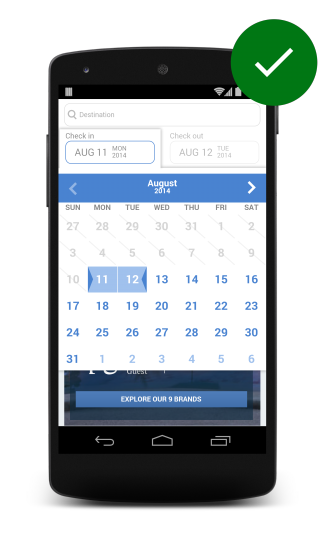
Users often need more context when scheduling appointments and travel dates, to make things easier and prevent them from leaving your site to check their calendar app, provide a visual calendar with clear labeling for selecting start and end dates.

Updated on 2014-08-11
Except as otherwise noted, the content of this page is licensed under the Creative Commons Attribution 3.0 License , and code samples are licensed under the Apache 2.0 License . For details, see our Site Policies .