When developing a mobile site with a
meta viewport
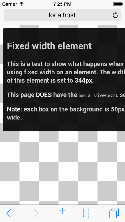
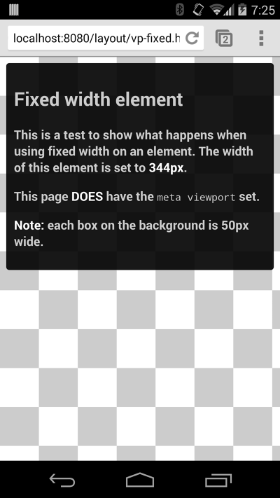
tag, it’s easy to accidentally create page content that doesn’t quite fit within the specified viewport. For example, an image that is displayed at a width wider than the viewport can cause the viewport to scroll horizontally. You should adjust this content to fit within the width of the viewport, so that the user does not need to scroll horizontally.
Since screen dimensions and width in CSS pixels vary widely between devices (e.g. between phones and tablets, and even between different phones), content should not rely on a particular viewport width to render well.
Setting large absolute CSS widths for page elements (such as the example below), will cause the
div
to be too wide for the viewport on a narrower device (e.g. a device with a width of 320 CSS pixels, such as an iPhone). Instead, consider using relative width values, such as
width: 100%
. Similarly, beware of using large absolute positioning values that may cause the element to fall outside the viewport on small screens.
 See example
 See example