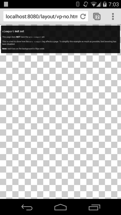
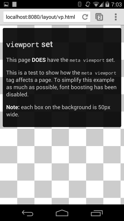
In order to attempt to provide the best experience, mobile browsers will render the page at a desktop screen width (usually about 980px, though this varies across devices), and then try to make the content look better by increasing font sizes and scaling the content to fit the screen. For users, this means that font sizes may appear inconsistently and they have to double-tap or pinch-zoom in order to be able to see and interact with the content.
<meta name="viewport" content="width=device-width, initial-scale=1.0">
Using the meta viewport value
width=device-width
instructs the page to match the screen’s width in device independent pixels. This allows the page to reflow content to match different screen sizes, whether rendered on a small mobile phone or a large desktop monitor.
Some browsers will keep the page’s width constant when rotating to landscape mode, and zoom rather than reflow to fill the screen. Adding the attribute
initial-scale=1
instructs browsers to establish a 1:1 relationship between CSS pixels and device independent pixels regardless of device orientation, and allows the page to take advantage of the full landscape width.
 See example
 See example