-
When the browser is between
0px
and
640px
wide,
max-640px.css
will be applied.
-
When the browser is between
500px
and
600px
wide, styles within the
@media
will be applied.
-
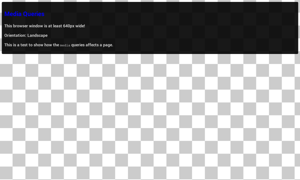
When the browser is
640px or wider
,
min-640px.css
will be applied.
-
When the browser
width is greater than the height
,
landscape.css
will be applied.
-
When the browser
height is greater than the width
,
portrait.css
will be applied.
A note on
min-device-width
It is also possible to create queries based on
*-device-width
; though this practice is
strongly discouraged
.
The difference is subtle but very important:
min-width
is based on the size of the browser window, whereas
min-device-width
is based on the size of the screen. Unfortunately some browsers, including the legacy Android browser may not report the device width properly and instead report the screen size in device pixels instead of the expected viewport width.
In addition, using
*-device-width
can prevent content from adapting on desktops or other devices that allow windows to be resized because the query is based on the actual device size, not the size of the browser window.
Use relative units
A key concept behind responsive design is fluidity and proportionality as opposed to fixed width layouts. Using relative units for measurements can help simplify layouts and prevent accidentally creating components that are too big for the viewport.
For example, setting width: 100% on a top level div, ensures that it spans the width of the viewport and is never too big or too small for the viewport. The div will fit, no matter if it’s a 320px wide iPhone, 342px wide Blackberry Z10 or a 360px wide Nexus 5.
In addition, using relative units allows browsers to render the content based on the users zoom level without the need for adding horizontal scroll bars to the page.
NO
div.fullWidth {
  width: 320px;
  margin-left: auto;
  margin-right: auto;
}
YES
div.fullWidth {
  width: 100%;
}