Please note that the contents of this offline web site may be out of date. To access the most recent documentation visit the online version .
Note that links that point to online resources are green in color and will open in a new window.
We would love it if you could give us feedback about this material by filling this form (You have to be online to fill it)


Animations

Animating Between Views

Many times you will want to move users between views in your application, whether that's a list to a details view, or show a sidebar navigation. Animations between these views are great for keeping the user engaged and add even more life to your projects.

TL;DR

  • Use transitions to move between views; avoid using `left`, `top` or any other property that triggers layout.
  • Ensure any animations you use are snappy and the durations are kept short.
  • Consider how your animations and layouts change as the screen sizes go up; what works for a smaller screen may look odd when used in a desktop context.

What these view transitions look and behave like will depend very much on the type of views you’re dealing with, so for example animating a modal overlay on top of a view should be a different experience to transitioning between a list and details view.

Note

  • You should be aiming to maintain 60fps for all of your animations. That way your users will not experience stuttering animations that pull them out of their experience. Ensure that any animating element has will-change set for anything you plan to change well ahead of the animation starting. For view transitions, it’s highly likely you will want to use will-change: transform .

Use translations to move between views

To make life a bit easier let’s assume there are two views: a list view and a details view. As the user taps on a list item inside the list view the details view will slide in, and the list view will slide out.
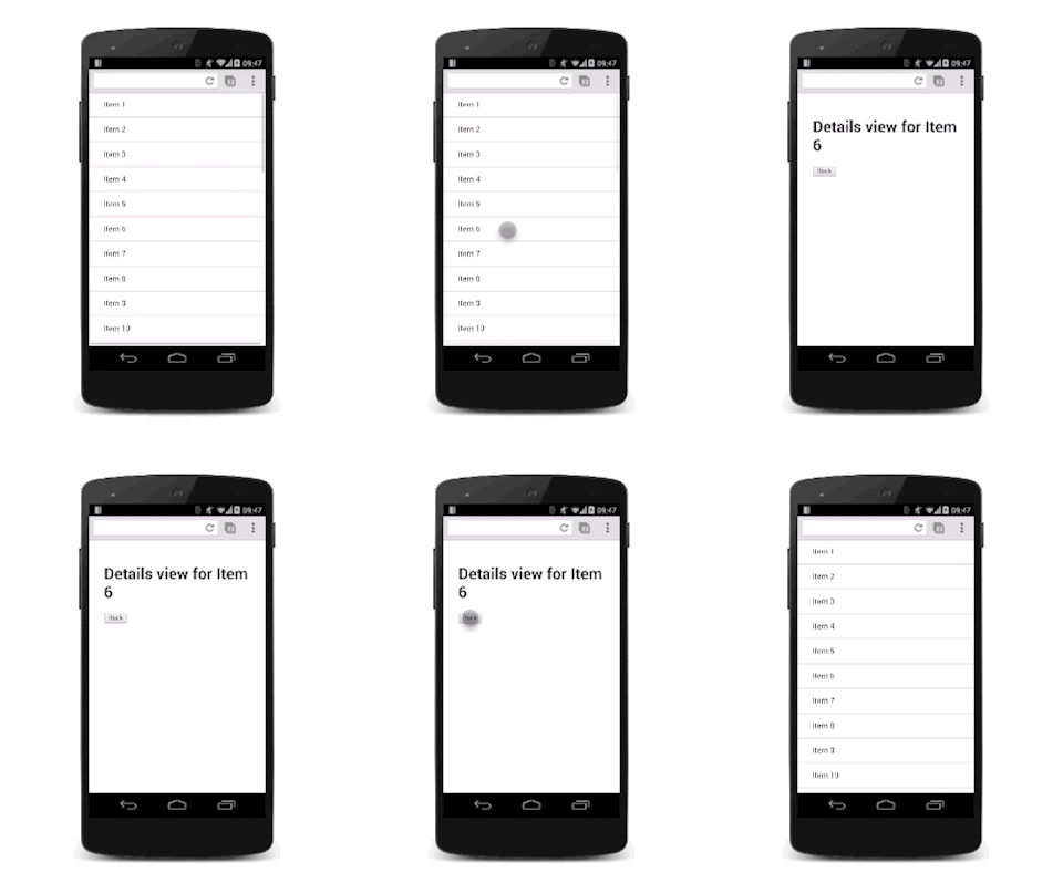
Translating between two views

To achieve this effect you will need a container for both views which has overflow: hidden set on it. That way the two views can both be inside it side-by-side without showing any horizontal scrollbars, and each view can slide side-to-side inside the container as needed.

View hierarchy.

The CSS for the container is:

.container {
  width: 100%;
  height: 100%;
  overflow: hidden;
  position: relative;
}

The position of the container is set as relative . This will mean that each view inside it can be positioned absolutely to the top left corner and then moved around with transforms. This approach is better for performance than using the left property (since that triggers layout and paint), and is typically easier to rationalize.

.view {
  width: 100%;
  height: 100%;
  position: absolute;
  left: 0;
  top: 0;

  /* let the browser know we plan to animate
     each view in and out */
  will-change: transform;
}

Adding a transition on the transform property provides a nice slide effect. To give it a nice feel it’s using a custom cubic-bezier curve, which we discussed in the Custom Easing guide .

.view {
  /* Prefixes are needed for Safari and other WebKit-based browsers */
  transition: -webkit-transform 0.3s cubic-bezier(0.465, 0.183, 0.153, 0.946);
  transition: transform 0.3s cubic-bezier(0.465, 0.183, 0.153, 0.946);
}

The view that is offscreen should be translated to the right, so in this case the details view needs to be moved:

.details-view {
  -webkit-transform: translateX(100%);
  transform: translateX(100%);
}

Now a small amount of JavaScript is necessary to handle the classes. This will toggle the appropriate classes on the views.

var container = document.querySelector('.container');
var backButton = document.querySelector('.back-button');
var listItems = document.querySelectorAll('.list-item');

/**
 * Toggles the class on the container so that
 * we choose the correct view.
 */
function onViewChange(evt) {
  container.classList.toggle('view-change');
}

// When you click on a list item bring on the details view.
for (var i = 0; i < listItems.length; i++) {
  listItems[i].addEventListener('click', onViewChange, false);
}

// And switch it back again when you click on the back button
backButton.addEventListener('click', onViewChange);

See sample.

You could expand this to cover multiple views, and the basic concept should remain the same; each non-visible view should be offscreen and brought on as needed, and the currently onscreen view should be moved off.

Note

  • Making this kind of hierarchy in a cross-browser way can be challenging. For example, iOS requires additional an additional CSS property, -webkit-overflow-scrolling: touch , to ‘reenable’ fling scrolling, but you don’t get to control which axis that’s for, as you can with the standard overflow property. Be sure to test your implementation across a range of devices!

In addition to transitioning between views this technique can also be applied to other slide-in elements, like sidebar navigation elements. The only real difference is that you shouldn’t need to move the other views.

Ensure your animation works with larger screens

For a larger screen you should keep the list view around all the time rather than removing it, and slide on the details view from the right hand side. It’s pretty much the same as dealing with a navigation view.

View hierarchy on a large screen.

Updated on 2014-08-08

Authors

Paul Lewis

Except as otherwise noted, the content of this page is licensed under the Creative Commons Attribution 3.0 License , and code samples are licensed under the Apache 2.0 License . For details, see our Site Policies .