Animations
Choosing the Right Easing
Having discussed the various options available for easing in animations, what kind should you use in your projects, and what kind of durations should your animations have?
Having discussed the various options available for easing in animations, what kind should you use in your projects, and what kind of durations should your animations have?
TL;DR
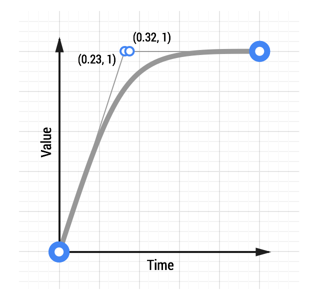
Generally speaking an ease-out will be the right call, and certainly a good default. It is quick to start, giving your animations a feeling of responsiveness, which is desirable, but with a nice slowdown at the end.
There are a group of well-known ease-out equations beyond the one specified with the
ease-out
keyword in CSS, which range in their ‘aggressiveness’. For a super snappy ease-out effect consider a
Quintic ease-out
.

See a Quintic ease-out animation.
Other easing equations, particularly bounces or elastic eases, should be used sparingly, and only when it’s appropriate to your project. There’s few things that bring a user out of an experience like a jarring animation. If your project isn’t jolly and fun, then don’t have UI elements boinging around the place! Conversely, if you’re making a site that is supposed to be lighthearted and fun then by all means bring the bounce!
Play around with eases, see which ones match your project’s personality, and go from there. A full list of easing types, along with demos, can be found at easings.net .
It is important that any animation added to your project has the correct duration. Too short and the animation will feel aggressive and sharp; too long and it will be obstructive and annoying.
Of course these are just guidelines. Experiment with your own eases and choose what feels right for your projects.
Updated on 2014-08-08
Except as otherwise noted, the content of this page is licensed under the Creative Commons Attribution 3.0 License , and code samples are licensed under the Apache 2.0 License . For details, see our Site Policies .