Links
Android Sites
Language
Results
Loading...
The Android platform runs on a variety of screen sizes and the system gracefully resizes your application's UI to fit each one. Typically, all you need to do is design your UI to be flexible and optimize some elements for different sizes by providing alternative resources (such as alternative layouts that reposition some views or alternative dimension values for views). However, sometimes you might want to go a step further to optimize the overall user experience for different screen sizes. For example, tablets offer more space in which your application can present multiple sets of information at once, while a handset device usually requires that you split those sets apart and display them separately. So even though a UI designed for handsets will properly resize to fit a tablet, it does not fully leverage the potential of the tablet's screen to enhance the user experience.
With Android 3.0 (API level 11), Android introduced a new set of framework APIs that allow you
to more effectively design activities that take advantage of large screens: the
Fragment
APIs. Fragments allow you to separate distinct behavioral components of your
UI into separate parts, which you can then combine to create multi-pane layouts when running on a
tablet or place in separate activities when running on a handset. Android 3.0 also introduced
ActionBar
, which provides a dedicated UI at the top of the screen to identify
the app and provide user actions and navigation.
This document provides guidance that can help you create an application that offers a unique and optimized user experience on both handsets and tablets, using fragments and the action bar.
Before you continue with this guide, it's important that you first read the guide to Supporting Multiple Screens . That document describes the fundamental design principles for developing a UI that supports different screen sizes and densities with flexible layouts and alternative bitmaps, respectively.
Here are a few guidelines that will help you create an app that provides an optimized user experience on both tablets and handsets:
A
Fragment
represents a behavior or a portion of user interface in an
activity. You can think of a fragment as a modular section of an activity (a "fragment" of an
activity), which has its own lifecycle and which you can add or remove while the activity is
running.
If you haven't used fragments yet, start by reading the Fragments developer guide.
The
ActionBar
is a UI component for activities that replaces the traditional
title bar at the top of the screen. By default, the action bar includes the application logo on the
left side, followed by the activity title, and access to items from the options menu on the right
side.
You can enable items from the options menu to appear directly in the action bar as "action items". You can also add navigation features to the action bar, such as tabs or a drop-down list, and use the application icon to supplement the system's Back button behavior with the option to navigate to your application's "home" activity or "up" the application's structural hierarchy.
This guide provides some tips for using the action bar in ways that support both tablets and handsets. For a detailed discussion of the action bar APIs, read the Action Bar developer guide.
A flexible layout design allows your application to adapt to variations in screen sizes. Not all tablets are the same size, nor are all handsets the same size. While you might provide different fragment combinations for "tablets" and "handsets", it's still necessary that each design be flexible to resize to variations in size and aspect ratio.
The following sections discuss the first two recommendations in more detail. For more information about creating flexible layouts, refer to the links provided above.
Note: Aside from one feature in the action bar, all the APIs needed to accomplish the recommendations in this document are available in Android 3.0. Additionally, you can even implement the fragment design patterns and remain backward-compatible with Android 1.6, by using the support library—discussed in the side bar below.
If you want to use fragments in your application and remain compatible with versions of Android older than 3.0, you can do so by using the Android Support Library (downloadable from the SDK Manager).
The support library includes APIs for
fragments
,
loaders
, and other APIs added in newer
versions of Android. By simply adding this library to your Android project, you can use
backward-compatible versions of these APIs in your application and remain compatible with Android
1.6 (your
android:minSdkVersion
value can be as low as
"4"
). For information about how to get the
library and start using it, see the
Support
Library
document.
The support library does not provide APIs for the action bar, but you can use code from the sample app, Action Bar Compatibility , to create an action bar that supports all devices.
The most effective way to create a distinct user experience for tablets and handsets is to create layouts with different combinations of fragments, such that you can design "multi-pane" layouts for tablets and "single-pane" layouts for handsets. For example, a news application on a tablet might show a list of articles on the left side and a full article on the right side—selecting an article on the left updates the article view on the right. On a handset, however, these two components should appear on separate screens—selecting an article from a list changes the entire screen to show that article. There are two techniques to accomplish this design with fragments:
The approach you choose depends on your design and personal preferences. The first option (one activity; swapping fragments) requires that you determine the screen size at runtime and dynamically add each fragment as appropriate—rather than declare the fragments in your activity's XML layout—because you cannot remove a fragment from an activity if it's been declared in the XML layout. When using the first technique, you might also need to update the action bar each time the fragments change, depending on what actions or navigation modes are available for each fragment. In some cases, these factors might not affect your design, so using one activity and swapping fragments might work well (especially if your tablet design requires that you add fragments dynamically anyway). Other times, however, dynamically swapping fragments for your handset design can make your code more complicated, because you must manage all the fragment combinations in the activity's code (rather than use alternative layout resources to define fragment combinations) and manage the back stack of fragments yourself (rather than allow the normal activity stack to handle back-navigation).
This guide focuses on the second option, in which you display each fragment in a separate activity when on a smaller screen. Using this technique means that you can use alternative layout files that define different fragment combinations for different screen sizes, keep fragment code modular, simplify action bar management, and let the system handle all the back stack work on handsets.
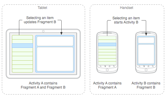
Figure 1 illustrates how an application with two fragments might be arranged for both handsets and tablets when using separate activities for the handset design:

Figure 1. Different design patterns for tablets and handsets when selecting an item to view its details.
In the application shown in figure 1, Activity A is the "main activity" and uses different layouts to display either one or two fragments at a time, depending on the size of the screen:
Note: Activity B is never used on a tablet. It is simply a container to present Fragment B, so is only used on handset devices when the two fragments must be displayed separately.
Depending on the screen size, the system applies a different
main.xml
layout file:
res/layout/main.xml
for handsets:
      <?xml version="1.0" encoding="utf-8"?>
<FrameLayout xmlns:android="http://schemas.android.com/apk/res/android"
    android:layout_width="match_parent"
    android:layout_height="match_parent">
    <!-- "Fragment A" -->
    <fragment class="

       com.example.android.TitlesFragment

      "
              android:id="@+id/list_frag"
              android:layout_width="match_parent"
              android:layout_height="match_parent"/>
</FrameLayout>
res/layout-large/main.xml
for tablets:
      <?xml version="1.0" encoding="utf-8"?>
<LinearLayout xmlns:android="http://schemas.android.com/apk/res/android"
  android:orientation="horizontal"
  android:layout_width="match_parent"
  android:layout_height="match_parent"
  android:id="@+id/frags">
    <!-- "Fragment A" -->
  <fragment class="

       com.example.android.TitlesFragment

      "
            android:id="@+id/list_frag"
            android:layout_width="@dimen/titles_size"
            android:layout_height="match_parent"/>
    <!-- "Fragment B" -->
  <fragment class="

       com.example.android.DetailsFragment

      "
            android:id="@+id/details_frag"
            android:layout_width="match_parent"
            android:layout_height="match_parent" />
</LinearLayout>
Android 3.2 (API level 13) adds new APIs that provide more fine-grain control over what screen sizes your app supports and what resources it uses, by declaring screen sizes based on the minimum width your layouts require. For example, both a 5" and 7" device qualify as a "large" screen, so your "large" layout resources are used on both devices. With API level 13, you can distinguish between these two sizes based on the screen width, as measured in density-independent pixels.
For details, read the blog post about New Tools for Managing Screen Sizes .
Note: Although the above sample layout for tablets is based on the "large" screen configuration qualifier, you should also use the new "minimum width" size qualifiers in order to more precisely control the screen size at which the system applies your handset or tablet layout. See the sidebar for more information.
How the application responds when a user selects an item from the list depends on whether Fragment B is available in the layout:
To implement this pattern for your application, it's important that you develop your fragments to be highly compartmentalized. Specifically, you should follow two guidelines:
To avoid directly calling one fragment from another, define a callback interface in each fragment class that it can use to deliver events to its host activity, which implements the callback interface. When the activity receives a callback due to an event (such as the user selecting a list item), the activity responds appropriately based on the current fragment configuration.
For example, Activity A from above can handle item selections depending on whether it's using the tablet or handset layout like this:
      public class MainActivity extends Activity implements TitlesFragment.OnItemSelectedListener {
    ...

    /** This is a callback that the list fragment (Fragment A)
        calls when a list item is selected */
    public void onItemSelected(int position) {
        DisplayFragment displayFrag = (DisplayFragment) getFragmentManager()
                                    .findFragmentById(R.id.display_frag);
        if (displayFrag == null) {
            // DisplayFragment (Fragment B) is not in the layout (handset layout),
            // so start DisplayActivity (Activity B)
            // and pass it the info about the selected item
            Intent intent = new Intent(this, DisplayActivity.class);
            intent.putExtra("position", position);
            startActivity(intent);
        } else {
            // DisplayFragment (Fragment B) is in the layout (tablet layout),
            // so tell the fragment to update
            displayFrag.updateContent(position);
        }
    }
}
When
DisplayActivity
(Activity B) starts, it reads the data delivered by the
Intent
and passes it to the
DisplayFragment
(Fragment B).
If Fragment B needs to deliver a result back to Fragment A (because Activity B was started with
startActivityForResult()
), then the process
works similarly with a callback interface between Fragment B and Activity B. That is, Activity B
implements a different callback interface defined by Fragment B. When Activity B receives the
callback with a result from the fragment, it sets the result for the activity (with
setResult()
) and finishes itself. Activity A then receives the
result and delivers it to Fragment A.
For a demonstration of this technique for creating different fragment combinations for tablets and handsets, see the updated version of the Honeycomb Gallery sample.
The
Action Bar
is an important UI
component for Android apps on both tablets and handsets. To ensure that the action bar
behaves appropriately on all screen sizes, it's important that you use the
ActionBar
APIs without adding complex customizations. By using the standard
ActionBar
APIs to design your action bar, the Android system does all
the work to gracefully adapt the action bar for different screen sizes. Here are some important
tips to follow when creating your action bar:
"always"
value
. In your
menu resource
, use
"ifRoom"
for the
android:showAsAction
attribute if you'd like the menu item to appear in the action
bar. However, you might need
"always"
when an action view does not provide a default
action for the overflow menu (that is, it must appear as an action view). However,
you should not use
"always"
more than once or twice. In almost all other cases, use
"ifRoom"
as the value for
"android:showAsAction"
when you want the item to appear as an
action item. Forcing too many action items into the action bar can create a cluttered UI and
action items may overlap with other action bar elements such as the title or navigation items.
showAsAction="ifRoom|withText"
.
This way, if there's not enough room for the title, but there is enough room for the icon, then only
the icon may be used.
"withText"
, because users can view the title as a "tool-tip" by performing a
"long click" on the item—the title text appears momentarily in a toast message. Providing
a title is also critical for accessibility, because screen readers read aloud the item title
even when not visible.
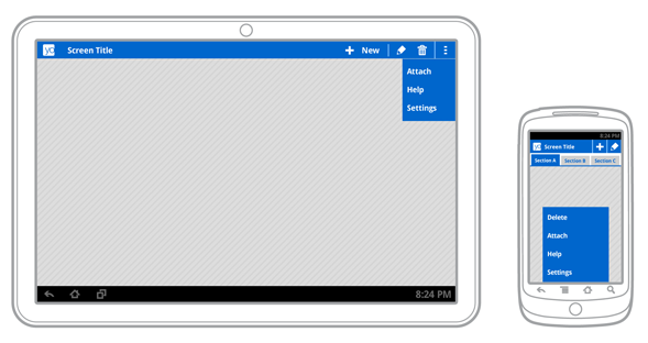
For example, the mock-ups below demonstrate how the system may adapt an action bar based
on the available screen space. On the handset, only two action items fit, so the remaining menu
items appear in the overflow menu (because
android:showAsAction
was set to
"ifRoom"
)
and the tabs appear in a separate row (the stacked action bar). On the tablet, more action items can
fit in the action bar and so do the tabs.

Figure 2. Mock-up showing how the system re-configures action bar components based on the available screen space.
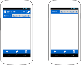
When your application is running on Android 4.0 (API level 14) and higher, there's an extra mode available for the action bar called "split action bar." When you enable split action bar, a separate bar appears at the bottom of the screen to display all action items when the activity is running on a narrow screen (such as a portrait handset). Splitting the action bar ensures that a reasonable amount of space is available to display action items on a narrow screen and also leave room for navigation and title elements at the top.
To enable split action bar, simply add
uiOptions="splitActionBarWhenNarrow"
to your
<activity>
or
<application>
manifest element.

Figure 3. Split action bar with navigation tabs on the left; with the app icon and title disabled on the right.
If you'd like to hide the main action bar at the top, because you're using the built-in
navigation tabs along with the split action bar, call
setDisplayShowHomeEnabled(false)
to disable the
application icon in the action bar. In this case, there's now nothing left in the main action bar,
so it disappears and all that’s left are the navigation tabs at the top and the action items at the
bottom, as shown by the second device in figure 3.
Note:
Although the
uiOptions
attribute was added in Android
4.0 (API level 14), you can safely include it in your application even if your
minSdkVersion
is set to
a value lower than
"14"
to remain compatible with older versions of Android. When running on
older versions, the system simply ignores the attribute because it doesn't understand it. The only
condition to adding it to your manifest is that you must compile your application against a platform
version that supports API level 14 or higher. Just be sure that you don't openly use other APIs in
your application code that aren't supported by the version declared by your
minSdkVersion
attribute.
As discussed in the Action Bar developer guide, you can use the application icon in the action bar to facilitate user navigation when appropriate—either as a method to get back to the "home" activity (similar to clicking the logo on a web site) or as a way to navigate up the application's structural hierarchy. Although it might seem similar to the standard Back navigation in some cases, the up navigation option provides a more predictable navigation method for situations in which the user may have entered from an external location, such as a notification, app widget, or a different application.
When using fragments in different combinations for different devices, it's important to give extra consideration to how your up navigation behaves in each configuration. For example, when on a handset and your application shows just one fragment at a time, it might be appropriate to enable up navigation to go up to the parent screen, whereas it's not necessary when showing the same fragment in a multi-pane configuration.
For more information about enabling up navigation, see the Action Bar developer guide.
ListView
, consider how you might provide more or less
information in each list item based on the available space. That is, you can create alternative
layouts to be used by the items in your list adapter such that a large screen might display more
detail for each item.