Home Page and Navigation Principles
Keep Calls To Action Front and Center
It can be easy for mobile users to miss menu items, so always put your key calls-to-action where you know users will see them.
It can be easy for mobile users to miss menu items, so always put your key calls-to-action where you know users will see them.
Study participants had the easiest time completing tasks on sites that clearly displayed primary calls-to-action in the main body of the site, with secondary tasks available through menus or below the fold. Your mobile calls-to-action will probably be different than on desktop, put yourself in your users’ shoes when determining placement.


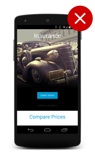
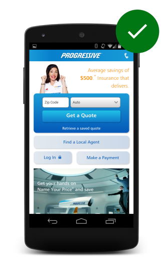
When users get to a site, they typically have a particular task in mind. The site on the left only only offers users a Learn more button, while on the right, users are able to quickly get a quote, find a local agent, make a payment or log in.
Updated on 2014-08-07
Except as otherwise noted, the content of this page is licensed under the Creative Commons Attribution 3.0 License , and code samples are licensed under the Apache 2.0 License . For details, see our Site Policies .