Home Page and Navigation Principles
Don't let promotions steal the show
Promotions and ads can overshadow the content they're next to, and make it harder for users to accomplish tasks.
Promotions and ads can overshadow the content they're next to, and make it harder for users to accomplish tasks.
Participants visiting one company’s mobile site were distracted by a large promotional banner and missed the navigational buttons beneath it, making it hard for them to learn more about the company’s offerings.


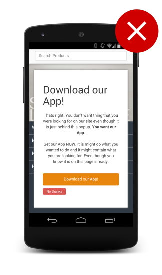
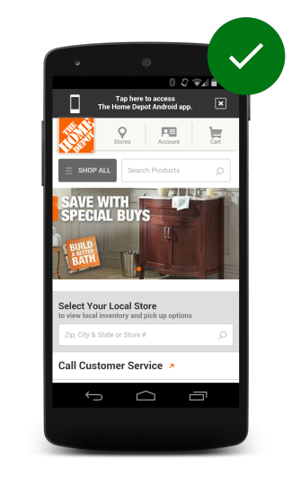
For app promotions, use easily dismissible banners, which were preferred by study participants; as opposed to large interstitials (also known as door slams).
Updated on 2014-08-07
Except as otherwise noted, the content of this page is licensed under the Creative Commons Attribution 3.0 License , and code samples are licensed under the Apache 2.0 License . For details, see our Site Policies .