Please note that the contents of this offline web site may be out of date. To access the most recent documentation visit the online version .
Note that links that point to online resources are green in color and will open in a new window.
We would love it if you could give us feedback about this material by filling this form (You have to be online to fill it)


Build Your Site

Build Site with Web Starter Kit

The Web Starter Kit starter files and tools provide most of what you need to incorporate responsive and performance checks as part of your developer workflow. Use this guide to build a site using the Web Starter Kit. Learn how to track code changes, apply responsive styles, optimize, and debug across devices.

TL;DR

  • Don't wait to test how your site looks across devices; check your site's responsiveness as you code.
  • Optimize your site as you code; make PageSpeed checks an iterative step in your coding workflow.
  • Identify and follow UX patterns; style guidelines aren't optional.
  • Debug on multiple devices; use the Web Starter Kit live loading and browser developer tools to debug on as many devices as you can.

Build this sample app

To see the Web Starter Kit tools in action, this guide walks you through the build process as you add an image, update HTML and CSS, and add some JavaScript to your starter project. If you want a quick peak at what the Web Starter Kit tools can do, skip ahead to this quick summary .

Before you start, make sure you’ve set up the Web Starter Kit . When you are finished the walking through the steps in this guide, this is what you’ll see in your browser:

JavaScript added to site

Track code changes and optimize

When you’re ready to write code, run gulp serve . This tool tracks changes as you code, reloads live changes in your browser, and automatically runs optimization tools specific to the changes made. For example, when you add an image, the image is automatically optimized and loaded in any browser instance open on any device.

Important

  • Check responsiveness as often as possible. Shrink the browser to tablet and phone size to see how content behaves all the time.

Add an image

To see the gulp serve tool in action: add awesome-photo.jpg to the images folder.

$ cp awesome-photo.jpg web-starter-kit/app/images

$ git add awesome-photo.jpg

Add the image to main in index.html :

<main>
  <h1>Hello.</h1>
  <p>Welcome to Web Starter Kit.</p>
  <div><img src="/images/awesome-photo.jpg"></div>
</main>

As you save index.html , watch your terminal. The gulp serve tool runs the image through imagemin and outputs the optimized image in the dist folder.

Note

  • You can also run gulp images to manually optimize images across your project.

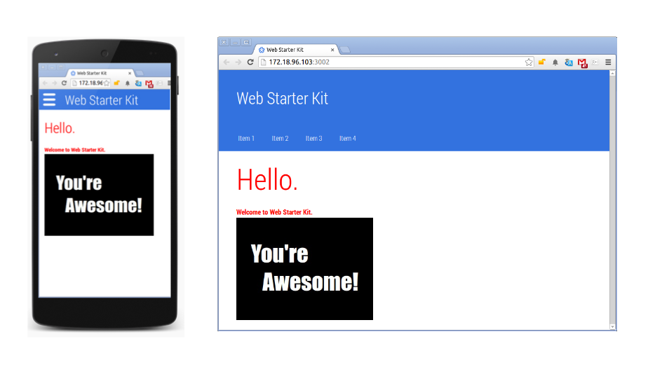
Reload the browser live to see the image:

image added to site

Don’t forget to resize the browser to see how the image looks on different device sizes.

Remember

  • As you code, keep your terminal and local staged version open in your browser. Watch the terminal for tooling results; watch the browser for newly staged content.

Add CSS

When you add style changes, gulp serve runs the gulp-minify-css tool , minifying CSS and injecting it into all connected browsers.

Add this style change to the main.css in web-starter-kit/apps/styles folder:

main {
    margin: 0 auto;
    /* Height of the header */
    padding: 60px 16px 16px 16px;
    font-size: 16px;
    font-weight: bold;
    color: red;
}

Reload and resize the browser to see how the styles look:

image added to site

Note

  • Run gulp styles tool to manually check CSS across your project. The gulp serve tool automatically runs this tool when you change CSS files.

Apply UX patterns

Don’t write a style guide as an afterthought. Start your project off with UX patterns, and apply these patterns as you code. Don’t have a style guide? Use the Web Starter Kit style guide which aligns with the Web Fundamentals Style Guidelines .

$ cd web-starter-kit/app/styleguide/

Here’s a sneak peak at some of the styles covered:
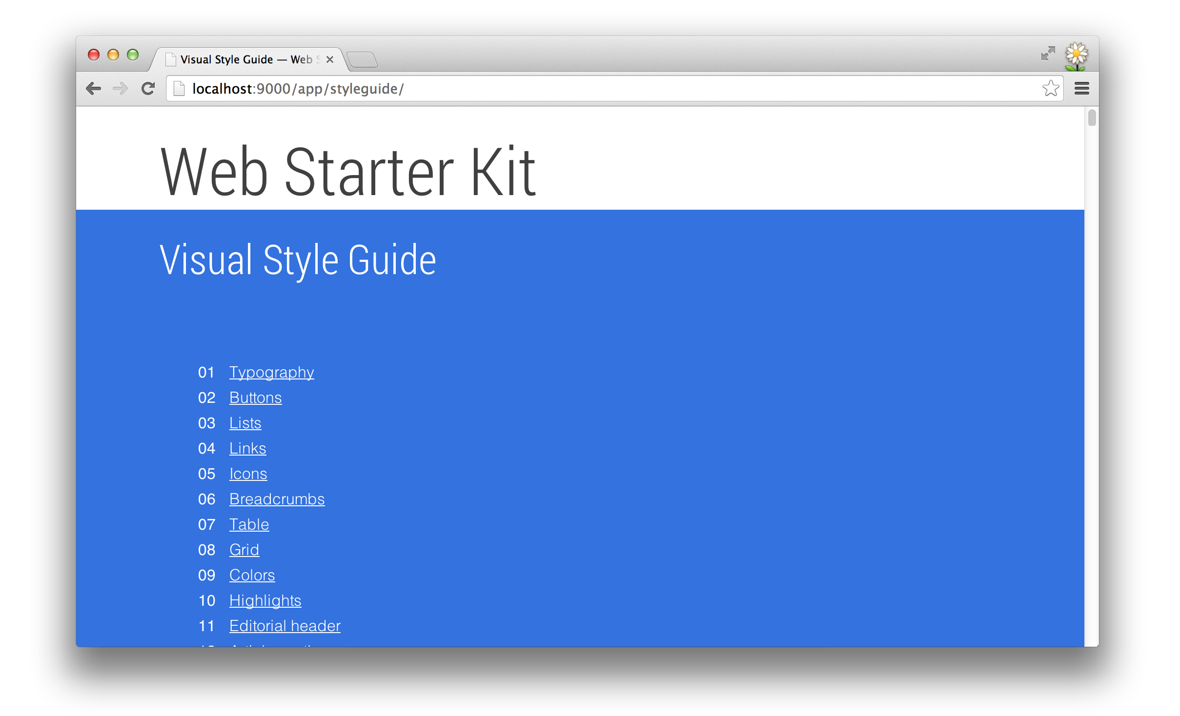
style guide table of contents

Add JavaScript

The gulp serve tool minifies your JavaScript ( gulp-jsmin ) and detects errors using gulp jshint .

Update index.html and add the newly created script, and a <span> that will be the container where the date is placed:

<main>
    <h1>Hello.</h1>
    <p>Welcome to Web Starter Kit.</p>
    <div><img src="/images/awesome-photo.jpg"></div>
    <span></span>
    <script src="/scripts/app.js" async></script> 
</main>

Create app.js in web-starter-kit/app/scripts :

var span = document.getElementsByTagName('span')[0];
span.textContent = 'the amazing '; // change DOM text content
span.style.display = 'inline';  // change CSSOM property
// create a new element, style it, and append it to the DOM
var loadTime = document.createElement('div');
loadTime.textContent = 'You loaded this page on: ' + new Date();
loadTime.style.color = 'blue';
document.body.appendChild(loadTime);

Reload the browser:
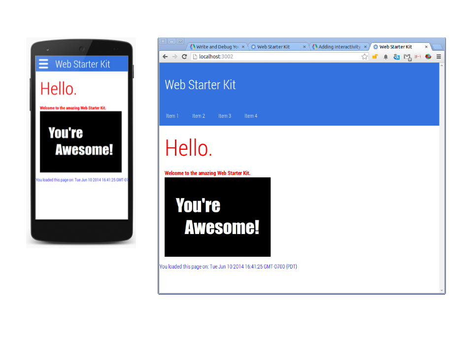
JavaScript added to site

Check performance

Now that you’ve added some html, CSS, and JavaScript, it’s time to checkout how the project is performing.

The Web Starter Kit integrates with PageSpeed Insights . If you haven’t used PageSpeed Insights, you are about to start.

Once you’ve got a chunk of work done and you want to check your site’s speed and user experience, stop gulp serve (control-C), and run gulp pagespeed :
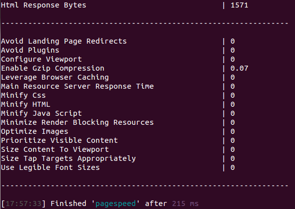
PageSpeed results

The good news: you got a perfect User Experience score. Yay!

The Speed Score is off by 1 point; compression isn’t enabled. You won’t compress your site until you are ready to host it.

For more information on how to fix your site based on these PageSpeed results, see PageSpeed Rules and Recommendations .

Debug your code on multiple devices

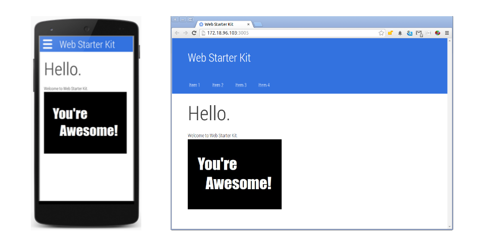
Up till now, you’ve checked your code by resizing the browser. This is a good first step, but it’s no substitute for debugging your code on actual devices. The gulp serve tool makes it easy to access staged content on multiple devices. You can then use the browser developer tools to debug, just the same as your current development workflow.

Important

  • There's no substitute for a real device. Access the externally friendly staging address on a phone and tablet that you keep handy for debugging purposes. If you're limited to a desktop, use the Chrome DevTools emulation tool .

Access staged content on external devices

The gulp serve tool makes it easy to access a staged version of your content on external devices.

In your terminal, notice two access points: a local address (for example, http://localhost:3002 ) and an externally friendly address for accessing on other devices (for example, http://123.45.67.103:3002 ).

Navigate to the second address on any other device. Any changes you make to your site are automatically pushed to all local instances; you just have to reload.

Remember

  • External devices must be on the same network as your development machine to accesses the external address.

Use Chrome DevTools to remote debug your code

You can use the full suite of Chrome DevTools (including performance profiling with Timeline) to debug any page in your site on any device. Assuming you can connect your phone to the same network as your development machine, simply load the page on the device using the externally friendly URL returned by gulp serve .

Any changes you make to a page using Chrome DevTools are automatically visible in all open instances of your staged site. Don’t reload a URL, or you will lose DevTools changes.

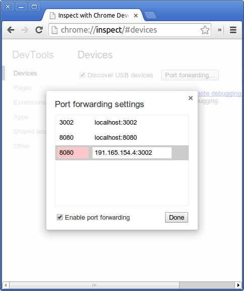
You can also debug using port forwarding. Port forwarding makes it easy to connect Chrome on Android to a web server running on your localhost, something that some network environments make difficult without some DNS tricks.

Follow the port forwarding set-up instructions (you need to set up remote debugging first). Then enter the desired port number and externally friendly IP address of your staged site:

Use port-forwarding to access staged site on phone

Summary of Web Starter Kit tools

A quick summary of the Web Starter Kit Tools:

Tool Description
gulp Runs all gulp tools and outputs the results to the distribution folder.
gulp html Minifies the content using gulp-minify and pushes it distribution folder. New content is staged live automatically.
gulp images Runs images through imagemin and outputs optimized images in the distribution folder.
gulp jshint Detects JavaScript errors using gulp jshint .
gulp pagespeed Checks your site's speed and user experience using PageSpeed Insights rules and returns the results.
gulp serve Serves the files in the distribution folder to your local machine and an external URL. It also tracks changes as you code: reloads live changes in your browser and automatically runs optimization tools specific to the changes made.
gulp styles Minifies CSS using the gulp-minify-css tool , and injects it into all connected browsers.

Updated on 2014-05-29

Except as otherwise noted, the content of this page is licensed under the Creative Commons Attribution 3.0 License , and code samples are licensed under the Apache 2.0 License . For details, see our Site Policies .