Build Your Site
Debug with Chrome DevTools
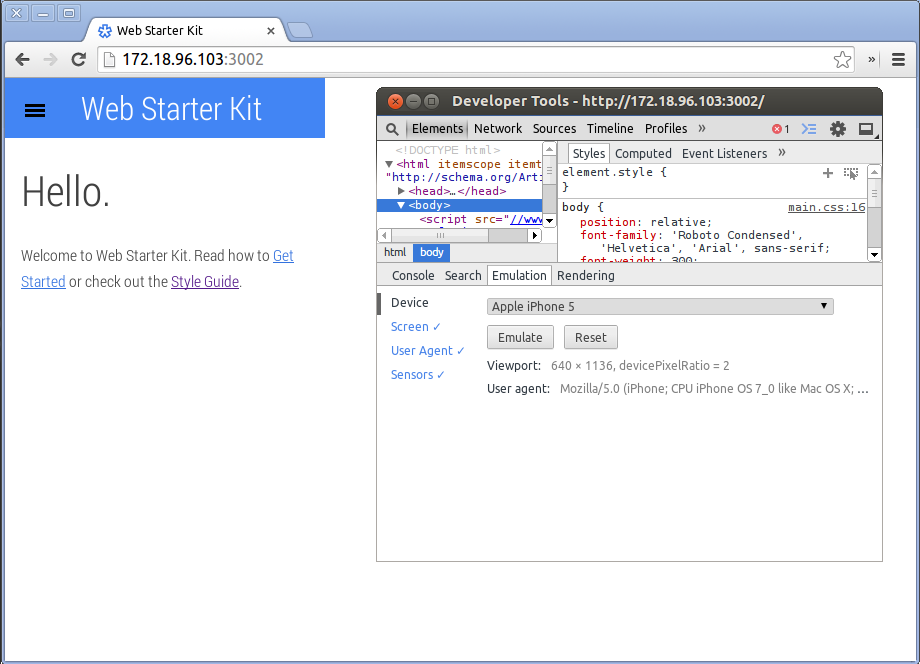
Use Chrome DevTools on your development machine to debug on your mobile device. Inspect, debug, analyze your site on any device from your desktop.
Use Chrome DevTools on your development machine to debug on your mobile device. Inspect, debug, analyze your site on any device from your desktop.
TL;DR
At the very start of your project, keep Chrome DevTools open and emulate your site on at least one mobile device.
As you code and debug your code, check how your site responds on the mobile device. This is a key habit to acquire as part of your development workflow.

With Web Starter Kit + Chrome DevTools, debug your site on real and emulated devices with one-click:
gulp build
returns this URL).
Choose any open tab, access the Chrome DevTools, and start debugging. Live reloading and synchronization lets you debug on all real and emulated devices at the same time.
Users won’t stay on any page that performs badly in normal network conditions; and they will lose patience fast even when network connectivity is shakey.
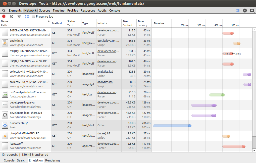
Check network performance on real devices and preferably in varying network connectivity. Record how your site behaves on the network, and pay close attention to the timeline.
You don’t want the timeline to show everything happening at the end of a page render; you do want a more optimized render, where some assets load in different frames on the timeline:

Important
Use the emulation tool to check the layout of your site on a range of devices. This tool automatically sets the layout of a URL to the selected device.
Dive deeper into the responsiveness of your site on an emulated device, by changing the settings in the Screen pane:
| Setting | Description |
|---|---|
| Emulate screen resolution | By default, matches the actual dimensions of the selected device. Uncheck the Emulate screen setting and enter any new dimensions. |
| Enable text autosizing | Emulate font boosting which occurs on mobile devices. Android artificially increases the font metrics used by text autosizing. Enabled by default only when emulating an Android device. |
| Emulate viewport | Zooms the page out to the physical default viewport of that device. |
| Shrink to fit | Ensures the emulated device screen is completely visible within your browser window. This setting does not emulate the device differently. |
| CSS media | Print is the default media type; additional media types include tv, speech, projection, and more. This setting does not emulate the device differently. |
Updated on 2014-05-29
Except as otherwise noted, the content of this page is licensed under the Creative Commons Attribution 3.0 License , and code samples are licensed under the Apache 2.0 License . For details, see our Site Policies .