Set Up Environment
Set Up Developer Tools
Learn how to set up essential tools for the multi-device development workflow. Your tools should test your site's responsiveness and performance with minimum manual effort.
Learn how to set up essential tools for the multi-device development workflow. Your tools should test your site's responsiveness and performance with minimum manual effort.
TL;DR
There’s no shortage of options when it comes to tools in the web development world. There’s often so much choice, it’s daunting. You find the simplest path to building a great site and stick with it as long as it’s working for you.
But if you want your site to work on small devices with unreliable network connectivity, you must invest the time and effort it takes to learn how to use build tools that will optimize performance and check your site’s responsiveness across devices.
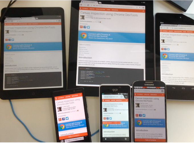
Tools for testing across devices include a combination of actual devices, device emulation, and device debugging tools. It’s kind of scary, the thought of testing your site on any number of devices. But you need to do this and you need the tools to make this possible:

You need to save as much time as you can for the extra effort it takes to test across devices. If you are still looking at a list of command shortcuts every time you make your way into the terminal and/or you are manually typing the same long commands, it’s time to create some short-cuts.
The easiest way create command-line short-cuts is to add aliases for common commands to your
bashrc
file. On Mac or Linux:
open -a 'Sublime Text' ~/.bashrc
.
alias master='git checkout master'
.
master
.
Another slightly more advanced way to create short-cuts is to store dotfiles in GitHub . One major gain: your short-cuts won’t be device dependent.
Note
You don’t have to, but we recommend aliases for these common commands:
| Command | Alias |
|---|---|
| Launch a server | alias server="python -m SimpleHTTPServer" |
| Fire up your editor | alias st='open -a "Sublime Text"' |
| Go to a directory you commonly work in | alias p="cd ~/projects" |
Checking your site’s responsiveness needn’t be a manual task. Get at least one tool to resize the browser, and preferably one with image capturing so that you can compare multiple views.
For Chrome, the
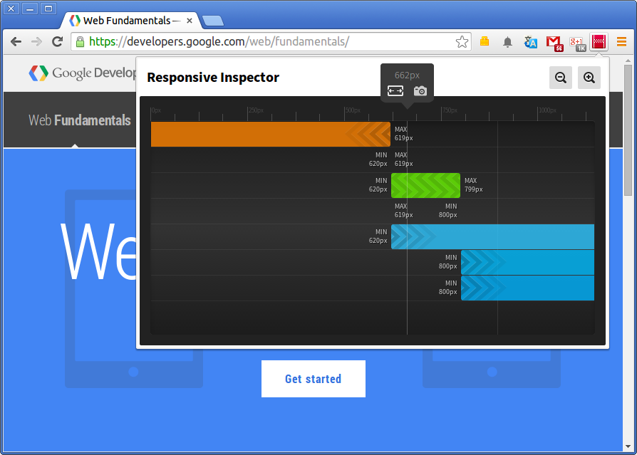
Responsive Inspect Chrome extension
visually shows the media queries of an opened site, including the
min-width
and
max-width
of each media query specified in CSS stylesheets. Use this tool to resize the site in the browser and take a screenshot:

To set up and use the extension:
To test on the Firefox browser, enable the Responsive Design View . Use this view to change the size of content area without having to resize the entire browser window.
Build tools streamline the process of transferring source files to a target result. You want build tools that keep track of your site’s performance; they optimize source files automatically and measure your site’s performance. We recommend Gulp . Other examples include: Grunt , Broccoli , Make .
You also want live reloading which will automatically update the page with any changes you make to your HTML, CSS, Javascript and images. No more manual refreshing of the page after every tweak.
Examples:
The Web Starter Kit does all this and more: watches for changes, optimizes files, builds your site, reloads the browser live and synchronizes scrolling, clicks, and navigation across all your devices. Follow the instructions in the next guide to set up the Web Starter Kit.
Don’t put off debugging your site across multiple devices. A very simple first step is to set up device emulation that integrates with debugging tools.
Using device emulators, such as iOS Safari Simulator , GenyMotion and the Official Android Emulator for Android devices as well as Modern.ie for versions of IE; you can see how your site works across a range of devices.
Chrome DevTools has a device emulation feature built in which mimics some device behaviors such as screen size, screen density and touch support; learn how to use DevTools emulation .
Emulation is a good start, but it’s no substitute for the real thing. Eventually, preferably as soon as possible, you must debug your site on actual devices. Remote debugging tools let you debug your site on a desktop and see changes on remote devices.
Here’s a brief comparison of remote debugging options, with links to set-up documentation:
| Remote Debugging Tool | Description |
|---|---|
| Chrome DevTools Remote Debugging | Use Chrome DevTools on your development machine to inspect, debug, and analyze browser tabs and WebViews on your Android device. |
| Weinre | Remote debugger for web pages. This is helpful when there is no remote debug tools available for a browser, for example the Android Browser on older devices (pre-KitKat). |
| Firefox for Android + ADB | Inspect or debug code running in Firefox for Android over USB. |
| Safari Web Inspector - Safari on iOS | Debug web content on iOS device directly from your desktop. |
Updated on 2014-05-29
Except as otherwise noted, the content of this page is licensed under the Creative Commons Attribution 3.0 License , and code samples are licensed under the Apache 2.0 License . For details, see our Site Policies .