Developer Docs
Dialogs
Dialogs prompt the user for decisions or additional information required by the app to continue a task. Such requests can range from simple Cancel/OK decisions to more complex layouts asking the user to adjust settings or enter text.
-
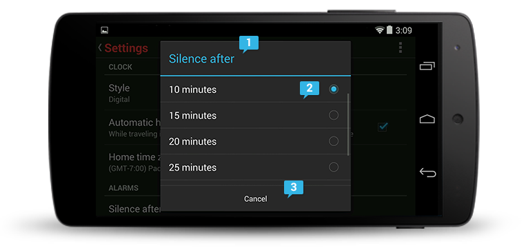
Optional title region
The title introduces the content of your dialog. It can, for example, identify the name of a setting that the user is about to change, or request a decision.
-
Content area
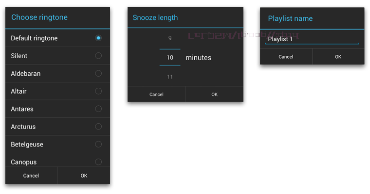
Dialog content varies widely. For settings dialogs, a dialog may contain UI elements such as sliders, text fields, checkboxes, or radio buttons that allow the user to change app or system settings. In other cases, such as alerts, the content may consist solely of text that provides further context for a user decision.
-
Action buttons
Action buttons are typically Cancel and/or OK, with OK indicating the preferred or most likely action. However, if the options consist of specific actions such as Close or Wait rather than a confirmation or cancellation of the action described in the content, then all the buttons should be active verbs. Order actions following these rules:
- The dismissive action of a dialog is always on the left. Dismissive actions return to the user to the previous state.
- The affirmative actions are on the right. Affirmative actions continue progress toward the user goal that triggered the dialog.
Alerts
Alerts inform the user about a situation that requires their confirmation or acknowledgement before proceeding. They differ slightly in appearance based upon the severity and impact of the message conveyed.
Alerts without title bars
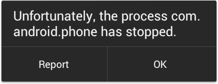
Most alerts don't need titles. Usually the decision doesn't have a severe impact and can be summed up succinctly in a sentence or two. The content area should either ask a question (such as "Delete this conversation?") or make a clear statement whose relationship to the action buttons is obvious.
Alerts with title bars
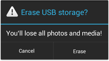
Use alerts with title bars sparingly. They are appropriate only when a high-risk operation involving potential loss of data, connectivity, extra charges, and so on requires a clear question or statement (the title) and some additional explanation (in the content area).
Keep the question or statement short: for example, "Erase USB storage?" Avoid apologies. A user should be able to skip the content completely and still have a clear idea of what choices are available based on the title and the text of the action buttons.
When crafting a confirmation dialog, make the title meaningful by echoing the requested action.
| Are you sure? |
|---|
| Warning! |
|---|
| Erase USB storage? |
|---|
Popups
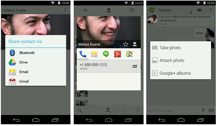
Popups are lightweight version of dialogs that require a single selection from the user. Popups don't have have explicit buttons that accept or cancel the operation. Instead, making a selection advances the workflow, and simply touching outside the popup dismisses it.
Toasts
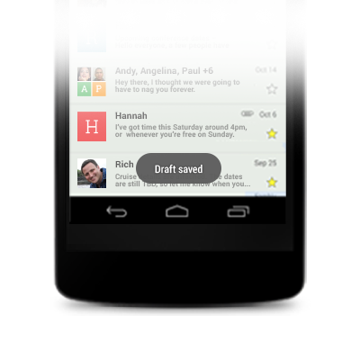
Toasts provide lightweight feedback about an operation in a small popup. For example, navigating away from an email before you send it triggers a "Draft saved" toast to let you know that you can continue editing later. Toasts automatically disappear after a timeout.
Developer Docs
Toasts
