Developer Docs
Grid View
Grid lists are an alternative to standard list views. They are best suited for showing data sets that represent themselves through images. In contrast to simple lists, grid lists may scroll either vertically or horizontally.
Generic Grids
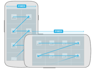
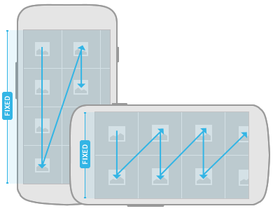
The items in a grid list are arranged in two dimensions, one of which is fixed when scrolling content. The scrolling direction dictates the ordering of the items within the grid list. Since the scrolling direction is not deterministic, make it easy for the user to determine the orientation by cutting off grid items to communicate where the overflow is located.
Avoid creating grid lists that scroll in two dimensions.

Vertical scrolling
Vertically scrolling grid list items are sorted in traditional western reading direction: left-to-right and top-down. When displaying the list, cut off the items in the bottom row to communicate that the user can scroll the list down to show additional items. Be sure to retain this scheme when the user rotates the screen.

Horizontal scrolling
Horizontally scrolling lists fix the vertical axis of the item grid. Compared to vertically scrolling lists, the sorting changes slightly to a top-down and left-to-right arrangement. Employ the same technique of cutting off the items in the rightmost column to indicate the scrolling direction.
Don't use scrolling tabs as a means to switch views in conjunction with horizontally scrolling grid lists, because the horizontal gesture for view and content navigation will conflict. If you show scrolling tabs for view navigation together with a grid list, use vertical grid scrolling for list navigation.
Grid List with Labels
Use labels to display additional contextual information for your grid list items.

Style
Use semi-transparent panels on top of the grid list items to display your labels. This allows you to control the contrast and ensures legibility of the labels while letting the content "shine through".