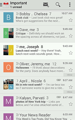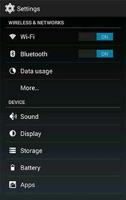

Themes are Android's mechanism for applying a consistent style to an app or activity. The style specifies the visual properties of the elements that make up your user interface, such as color, height, padding and font size. To promote greater cohesion between all apps on the platform, Android provides two system themes that you can choose from when building apps:
- Holo Light
- Holo Dark
Applying these themes will go a long way in helping you to build apps that fit right into the general visual language of Android.
Pick the system theme that best matches the needs and design aesthetics for your app. If your desire is to have a more distinct look for your app, using one of the system themes as a starting point for your customizations is a good idea. The system themes provide a solid foundation on top of which you can selectively implement your own visual stylings.
Developer Guide
For information about how to apply themes such as Holo Light and Dark, and how to build your own themes, see the Styles and Themes API guide.