Please note that the contents of this offline web site may be out of date. To access the most recent documentation visit the online version .
Note that links that point to online resources are green in color and will open in a new window.
We would love it if you could give us feedback about this material by filling this form (You have to be online to fill it)

Your Branding

Following Android design patterns doesn't mean that your app has to look the same as everyone else's. In Android, your app can shine as an extension of your brand.

Color

Use your brand color for accent by overriding the Android framework's default blue in UI elements like checkboxes, progress bars, radio buttons, sliders, tabs, and scroll indicators.

Look for opportunities to use high-contrast color for emphasis, for example, as the background color of the action bar or a primary button. But don't go overboard: not all actions are equal, so use it only for the one or two most important things.

When customizing colors, touch feedback should be subtle — just slightly lighter or darker than the untouched color.
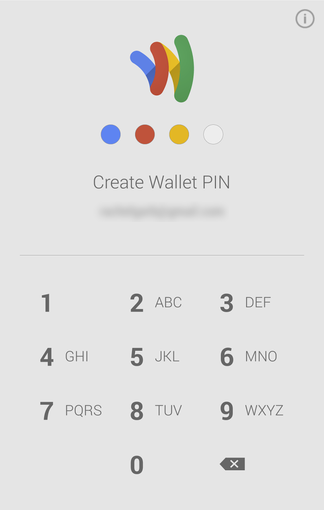
 
The four colors of the Google Wallet logo provide a playful accent to the four dots that appear as the user enters a PIN.
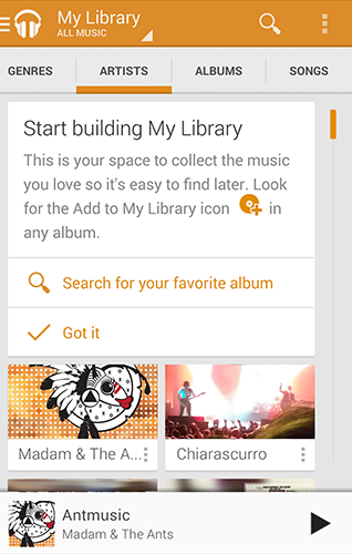
The Google Play Music app has an orange theme color, which is used for emphasis in the action bar and for accent in the selected tab, scroll indicator, and hyperlinks.

Your app's launcher icon is a key place to incorporate your logo, because it's what users will look for and touch to begin using your app. You can carry the launcher icon through to all the screens in your app by showing it in the action bar along with the name of the app.

Another approach to consider is to have your logo take the place of the launcher icon and app name in the action bar.
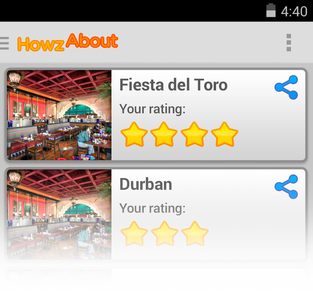
 
Google+ reinforces its brand by carrying its launcher icon through to the action bar.
Example of a the logo in the action bar. This works well in cases where the brand's logo matches the name of the app.

If you have icons that you're already using for your app on other platforms and they have a distinctive look intended to fit your brand, use them on your Android app as well. If you take this approach, make sure your brand styling is applied to every single icon in your app .

One exception: For any icon in your existing set where the symbol is different from Android's, use Android's symbol but give it your brand's styling. That way, users will understand what the purpose of the icon is based on what they've learned in other Android apps (Design principle: Give me tricks that work everywhere ). But the icon will still look like it belongs with all of your other icons as a part of your brand.

Example :

The brand's normal icon for sharing on other platforms is a right arrow.

Don't Do

What if you don't already have your own icons — for example, if you're creating a brand new app only for Android? In this case, use Android's standard icons and rely more on color and logo for branding. Get the Action Bar Icon Pack, available for free in Downloads .