This lesson teaches you to
- Handle D-pad Navigation
- Provide Clear Visual Indication for Focus and Selection
- Design for Easy Navigation
You should also read
An important aspect of the user experience when operating a TV is the direct human interface: a remote control. As you optimize your Android application for TVs, you should pay special attention to how the user actually navigates around your application when using a remote control instead of a touchscreen.
This lesson shows you how to optimize navigation for TV by:
- Ensuring all layout controls are D-pad navigable.
- Providing highly obvious feedback for UI navigation.
- Placing layout controls for easy access.
Handle D-pad Navigation
On a TV, users navigate with controls on a TV remote, using either a D-pad or arrow keys. This limits movement to up, down, left, and right. To build a great TV-optimized app, you must provide a navigation scheme in which the user can quickly learn how to navigate your app using the remote.
When you design navigation for D-pad, follow these guidelines:
- Ensure that the D-pad can navigate to all the visible controls on the screen.
- For scrolling lists with focus, D-pad up/down keys scroll the list and Enter key selects an item in the list. Ensure that users can select an element in the list and that the list still scrolls when an element is selected.
- Ensure that movement between controls is straightforward and predictable.
Android usually handles navigation order between layout elements automatically, so you don't need to do anything extra. If the screen layout
makes navigation difficult, or if you want users to move through the layout in a specific way, you can set up explicit navigation for your
controls.
For example, for an
android.widget.EditText
, to define the next control to receive focus, use:
<EditText android:id="@+id/LastNameField" android:nextFocusDown="@+id/FirstNameField"\>
The following table lists all of the available navigation attributes:
| Attribute | Function |
|---|---|
nextFocusDown
|
Defines the next view to receive focus when the user navigates down. |
nextFocusLeft
|
Defines the next view to receive focus when the user navigates left. |
nextFocusRight
|
Defines the next view to receive focus when the user navigates right. |
nextFocusUp
|
Defines the next view to receive focus when the user navigates up. |
To use one of these explicit navigation attributes, set the value to the ID (android:id value) of another widget in the layout. You should set up the navigation order as a loop, so that the last control directs focus back to the first one.
Note: You should only use these attributes to modify the navigation order if the default order that the system applies does not work well.
Provide Clear Visual Indication for Focus and Selection
Use appropriate color highlights for all navigable and selectable elements in the UI. This makes it easy for users to know whether the control is currently focused or selected when they navigate with a D-pad. Also, use uniform highlight scheme across your application.
Android provides Drawable State List Resources to implement highlights for selected and focused controls. For example:
res/drawable/button.xml:
       <?xml version="1.0" encoding="utf-8"?>
<selector xmlns:android="http://schemas.android.com/apk/res/android">
    <item android:state_pressed="true"
          android:drawable="@drawable/button_pressed" /> <!-- pressed -->
    <item android:state_focused="true"
          android:drawable="@drawable/button_focused" /> <!-- focused -->
    <item android:state_hovered="true"
          android:drawable="@drawable/button_focused" /> <!-- hovered -->
    <item android:drawable="@drawable/button_normal" /> <!-- default -->
</selector>
This layout XML applies the above state list drawable to a
Button
:
       <Button
    android:layout_height="wrap_content"
    android:layout_width="wrap_content"
    android:background="@drawable/button" />
Provide sufficient padding within the focusable and selectable controls so that the highlights around them are clearly visible.
Design for Easy Navigation
Users should be able to navigate to any UI control with a couple of D-pad clicks. Navigation should be easy and intuitive to understand. For any non-intuitive actions, provide users with written help, using a dialog triggered by a help button or action bar icon.
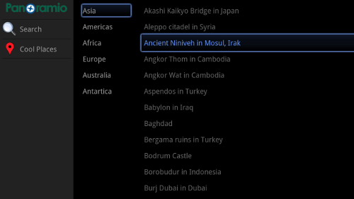
Predict the next screen that the user will want to navigate to and provide one click navigation to it. If the current screen UI is very sparse, consider making it a multi pane screen. Use fragments for making multi-pane screens. For example, consider the multi-pane UI below with continent names on the left and list of cool places in each continent on the right.

The above UI consists of three Fragments -
left_side_action_controls
,
continents
and
places
- as shown in its layout
xml file below. Such multi-pane UIs make D-pad navigation easier and make good use of the horizontal screen space for
TVs.
       <LinearLayout
    android:layout_width="match_parent"
    android:layout_height="match_parent"
    android:orientation="horizontal"
   >
   <fragment
        android:id="@+id/left_side_action_controls"
        android:layout_width="0px"
        android:layout_height="match_parent"
        android:layout_marginLeft="10dip"
        android:layout_weight="0.2"/>
    <fragment
        android:id="@+id/continents"
        android:layout_width="0px"
        android:layout_height="match_parent"
        android:layout_marginLeft="10dip"
        android:layout_weight="0.2"/>

    <fragment
        android:id="@+id/places"
        android:layout_width="0px"
        android:layout_height="match_parent"
        android:layout_marginLeft="10dip"
        android:layout_weight="0.6"/>

</LinearLayout>
Also, notice in the UI layout above action controls are on the left hand side of a vertically scrolling list to make them easily accessible using D-pad. In general, for layouts with horizontally scrolling components, place action controls on left or right hand side and vice versa for vertically scrolling components.